Friday, September 30, 2011
from my iphone photos
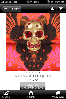
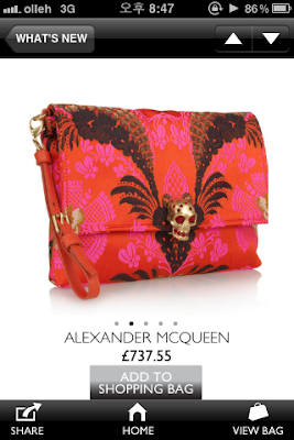
from the application called what's new.
that purse in ma wish list.
and love that gorgeous skeleton detail matched with the ethnic print and strong neon color.
Sunday, September 25, 2011
Wednesday, September 21, 2011
Stop the water while using me!
"Develop a brand for a high-quality range of cosmetics that meet the increasing requirements of an ecologically aware society and set new standards in environmental protection. The innovation: the message is the brand."
Designed by Korefe
Brands and their products in the future should be thinking about how to contribute to the society in any good ways and it makes consumers be touched and choose the products.
That cosmetic brand's concept is a really good example and the package designs are also machtable with its concept, simple and clear, by reducing any unneccessary designs.
Friday, September 16, 2011
Doritos Packaging Concept
This project was based on one of the YCN briefs where they asked from designers to create a totally new packaging concept for Doritos. Unfortunately, when I saw the brief the deadline was very close, but nevertheless I developed it.
The shape and the texture of the Doritos chips are used as the base of this packaging concept.


The Croatian Design Society organized a workshop for children aged 7-14 years where they were given the task to create artworks for this packaging. It is a great honor to be part of this and see the way these young designers think. I would like to thank to Izvorka Juric for organizing this.
Here are some photos from the workshop:


by http://www.behance.net/
i like the workshop thing, cuz it's easy and creative way to advertise the product naturally to children who are one of the big comsumers in the food market.
The shape and the texture of the Doritos chips are used as the base of this packaging concept.
What's good about the form of the packaging is its structure which can keep the chips closed after opening. Below you can see how this system works with the scaled-down prototype.
Currently I'm developing illustrations which can replace the textured solid colors. I also invite every designer interested in collaboration to create artworks of his own.
The artworks can be submitted inside this facebook group: http://bit.ly/tQvpUPlease download the Doritos Template Pack (http://bit.ly/rGY2V) which contains two different layered psd templates (see previews below) ready for you to apply the artwork.
I would really love to see what you will come up with!
The Croatian Design Society organized a workshop for children aged 7-14 years where they were given the task to create artworks for this packaging. It is a great honor to be part of this and see the way these young designers think. I would like to thank to Izvorka Juric for organizing this.
Here are some photos from the workshop:
by http://www.behance.net/
i like the workshop thing, cuz it's easy and creative way to advertise the product naturally to children who are one of the big comsumers in the food market.
Saturday, September 10, 2011
Stella McCartney, Print Collection
Stella McCartney, Print Collection
Stella McCartney's latest collection of fragrance is designed based on her latest collection of printed garments for summer 2011. The same jem shaped bottle as her previous collections are covered with beautiful floral prints. The "borders" gradates from dark to light, revealing the perfume within.


Saturday, September 3, 2011
SLICED BREAD NOTEBOOK
SLICED BREAD NOTEBOOK
The Best Thing Since Sliced Bread!
Taking notes can be super delicious, by using the Sliced Bread//Notebook.
The first step requires a delicious notebook to hold everything together.
It is a 12 slices/notebook set which has been packaged for convenience.
Each delicious slice has number on it. (1 to 12)
You can use each notebook for the related month.


From_Behance Network
The Best Thing Since Sliced Bread!
Taking notes can be super delicious, by using the Sliced Bread//Notebook.
The first step requires a delicious notebook to hold everything together.
It is a 12 slices/notebook set which has been packaged for convenience.
Each delicious slice has number on it. (1 to 12)
You can use each notebook for the related month.
From_Behance Network
Skullcandy Aviator
Check out this new packaging design for iconic headphones, Skullcandy. The Designers have chosen to move away from the current thick plastic packaging to smooth multi layered paper box. Adding dimension and "creating user experience that would leave lasting impression on the consumer that compliment the product's quality and style. This box is not something that most people would want to throw it away."
Designed by Skullcandy inc.
Subscribe to:
Comments (Atom)


